
Showing posts with label painting. Show all posts
Showing posts with label painting. Show all posts
Thursday, 25 April 2013
Pixie blue
Another watercolour I did this ages ago but did upload to here. There is no model for this I made it up I was more interested in playing with the colour and tone, limiting the palette and adding some pure white ink


My Rainbow Period

Continuing in this vein I did another one this time using the other daughter as the model and keeping with some of the same elements.
 |
| Moth |
What not to love about Cerulean blue and Opera rose, this time i've added some pen work in using and old fountain nib pen and burnt sienna ink.
As I get quite carried away with these paintings I did more with similiar colours only this time went back to the Angels I done before

Statue
Kept this one a little simple in watercolour.

And yet another Angel, pregnant one at that
wasnt sure this would work out very well but I'm quite happy with the results of this one, I went on to do another one like this but didnt like it as much.
So colours used were as mentioned Cerelaen blue, green gold, opera rose, permanent rose, Indigo and Dioxazine purple and cadium yellow. Finished with some white ink here and there.
Wednesday, 28 December 2011
botanicals anyone?
Happy new year to you all!!
Have you written out your list for the new year??? No nor have I..
check out my new website http://www.societyink.co.uk/ let me know what you think
1. draw meticulous drawing - adjust drawing a little so it looks nice as composition!
2. put the kettle on
3. make tea sit down and sigh
6. I started with the largest leaf so I could test the colours. you can still see the yellow base as I have left all the veins and worked in a negative manner.
This is time consuming work and while I love painting I don't love the slow progress you get with these paintings. Another cup of tea I think!
Moving on to the interesting part the flower head.
First pick a place to start and know that you should finish it completely before moving on. layers of sap green were laid in first then green gold over that went permanent rose and then dioxizine purple. All layers were left to dry first before the next.
The very darks have indigo mixed into purple and green. OK while that's drying lets do the stem - working pale washes of sap green and cerulean blue let each stroke dry to get the stripes down the stem. Then repeat a few times more to get the density but don't darken the washes it doesn't help.
You want nice clean even layers.
in the lighter areas apply some thin green gold and in the shadows apply sap green, cerulean blue and purple. leave to dry.
Back to flower head - continue to paint each petal separately

 next the fluffy fronds I used potters pink a colour i don't normally use but when mixed with opera rose makes a good likeness. darken with purples and or indigo in a few places. Leave some of the paper showing through to add lightness.
Water droplets for most part these have no colour of their own so I start with shadows then if necessary add a light was of local colour from the plant.
 And now to continue with the rest of the plant. As you see a little way to go yet. this could take a few weeks yet.
Have you written out your list for the new year??? No nor have I..
Not going to either I'm just going to add to last years list of I must do's, starting with the new website.It's only half completed but the basic skeleton is ready for upload. I've been having problems with the uploading, just cant seem to find the problem.
OK found the problem I didn't put the folder name in for the server. durgh!!!check out my new website http://www.societyink.co.uk/ let me know what you think
I think I have spent more time on the website than actually painting but I have managed to do a little bit of Botanical painting Globe Artichokes to be more precise I started these some time ago during the teaching some of my classes. I took the photo some years ago at the Eden Project in the pouring rain, it was always going to be one that i painted I just kept putting it off you see why below.
Here is how I got the finished artichoke head...1. draw meticulous drawing - adjust drawing a little so it looks nice as composition!
2. put the kettle on
3. make tea sit down and sigh
 |
| first coat of greens on leaf |
4. breathe deeply and begin.......
5. mix pale cadmium yellow to act as base for all green areas.
 |
| mixes of green gold, sap green,permanent rose and dioxzine purple |
 |
| you can see from this shot I have got yellow base layers and the green layers with a base of permanent rose for the flower tips |
This is time consuming work and while I love painting I don't love the slow progress you get with these paintings. Another cup of tea I think!
Moving on to the interesting part the flower head.
First pick a place to start and know that you should finish it completely before moving on. layers of sap green were laid in first then green gold over that went permanent rose and then dioxizine purple. All layers were left to dry first before the next.
The very darks have indigo mixed into purple and green. OK while that's drying lets do the stem - working pale washes of sap green and cerulean blue let each stroke dry to get the stripes down the stem. Then repeat a few times more to get the density but don't darken the washes it doesn't help.
You want nice clean even layers.
in the lighter areas apply some thin green gold and in the shadows apply sap green, cerulean blue and purple. leave to dry.
Back to flower head - continue to paint each petal separately


Water droplets for most part these have no colour of their own so I start with shadows then if necessary add a light was of local colour from the plant.

Tuesday, 26 July 2011
Finished at last
This week saw the start of my summer classes, all of which needed some prep for each of the classes. Not only in the advertising but in the lesson planning. The classes were centered around drawing watercolour and Thursdays will be Oils, so quite a mix of techniques and media going on. As the classes are only 3 hours long it's hard to get a completed piece of work for most students but the results were excellent, next week they will be completing a full tonal drawing which I think they will be impressed with. Today's watercolour class was using bold colours and learning to lift out. Not a class for the faint hearted!! This really throws students in at the deep end. Cant wait for Thursdays lesson Oil portraits.
During the time I've been working on the getting the classes up and running I've also continued to work on the piece below.....
I have finally finished the Large piece entitled " Stealing the wings of butterflies" you'll see from my last blog that I was a fair way into it, but still had a ton to do. Well since the last photo, i completed our heroine first with a white hair do then changed my mind back to red. while painting I realised that I would have been better do this in oils rather acrylics I'm much happier with slow drying paint - I don't need to make any adjustments for the paint drying darker or lighter.

I glazed over the white with burnt sienna, transparent red oxide and burnt orange. i was a little happier once this was finished - making changes half way through a painting can mess other areas up. Next was the wings hanging on the pole and guess what I did here?
Started with one colour and ended up with another, check out the black wing -this was too dark for the overall composition so that had to be changed.


 With the lighter wing in place i carried on putting the insects in some of which are made from glass.
The glass beads are made by a good friend of mine at http://www.flowerjasper.co.uk/ a very talented bead maker.
This is what happens to the broken ones!
 perfect for little bugs!!
 A little white moth not finished in this photo.
 base coats on for the Centinakes
 Add some mist and tweak here and there and we're finished Thanks for joining me
During the time I've been working on the getting the classes up and running I've also continued to work on the piece below.....
I have finally finished the Large piece entitled " Stealing the wings of butterflies" you'll see from my last blog that I was a fair way into it, but still had a ton to do. Well since the last photo, i completed our heroine first with a white hair do then changed my mind back to red. while painting I realised that I would have been better do this in oils rather acrylics I'm much happier with slow drying paint - I don't need to make any adjustments for the paint drying darker or lighter.

I glazed over the white with burnt sienna, transparent red oxide and burnt orange. i was a little happier once this was finished - making changes half way through a painting can mess other areas up. Next was the wings hanging on the pole and guess what I did here?
Started with one colour and ended up with another, check out the black wing -this was too dark for the overall composition so that had to be changed.


The glass beads are made by a good friend of mine at http://www.flowerjasper.co.uk/ a very talented bead maker.
This is what happens to the broken ones!


Friday, 22 October 2010
update on web building
i cant believe that is nearly November and i still haven't finished my website more to the point I haven't even finished one single painting I've started.
As I'm still working on some commissions its been nion impossible to get any other work done or for that matter started!
Needless to say I haven't started the Christmas cards for this year, and time is running out. Last years cards were negative space paintings which turned out rather well. This year will be touch and go whether I get any done in at all. The original plan was to paint some small Victorian vignettes, in monochrome with just a splash of colour somewhere.
My commission work is coming on well but is slow going as there is a lot of small detail on two of the paintings. And as I don't have all day everyday to work on them, due to teaching, they will have to take precedence over other things.
Recently some of my students have asked do some fantasy art with me, which is quite refreshing as this is where i started and where most of my commission work is. I drew a fairy with some pitcher plants and painted part of them in watercolour. Some of the best fantasy art I've seen has been those which include something from reality, whether this be an object or building etc added to the composition. I like the idea of using siomthing that we are familiar with in there so there something more beilevable to begin with, it makes the job a little easier. check out some of the artist on the http://www.imaginefx.com/ you'll find some of the best in the world here and you can access some workshops while your about it!
happy painting!!
As I'm still working on some commissions its been nion impossible to get any other work done or for that matter started!
Needless to say I haven't started the Christmas cards for this year, and time is running out. Last years cards were negative space paintings which turned out rather well. This year will be touch and go whether I get any done in at all. The original plan was to paint some small Victorian vignettes, in monochrome with just a splash of colour somewhere.
My commission work is coming on well but is slow going as there is a lot of small detail on two of the paintings. And as I don't have all day everyday to work on them, due to teaching, they will have to take precedence over other things.
Recently some of my students have asked do some fantasy art with me, which is quite refreshing as this is where i started and where most of my commission work is. I drew a fairy with some pitcher plants and painted part of them in watercolour. Some of the best fantasy art I've seen has been those which include something from reality, whether this be an object or building etc added to the composition. I like the idea of using siomthing that we are familiar with in there so there something more beilevable to begin with, it makes the job a little easier. check out some of the artist on the http://www.imaginefx.com/ you'll find some of the best in the world here and you can access some workshops while your about it!
happy painting!!
Monday, 3 May 2010
Pen & ink
Today I'm getting things together to do a demonstration for an Art group in Essex. After a visit to them last week where I demonstrated drawing they requested pen & wash/ink for this week. All things being well we will outside working from the landscape.
It struck me as I gather my things that this is probably the least used medium of them all, yet I find it the most liberating of them all. I've used pen and ink since I was 16 and find it made look more carefully and draw even more carefully. It wasn't until some years later that I realised that my drawing had improved 10 fold just because I couldn't rub my mistakes out, that gave me a great sense of freedom but also made me aware that the more mistakes I made the more creative I had to be to disguise them.
And therein lies the beauty of ink it never looks wrong it always looks expressive and impressive no matter of your style.
Over the past 2 years I have worked extensively in pen/ink on a major commission, at the moment I cant show you any of that as it's under copyright and it's ready for publication yet.
For now here is some of my early stuff......


It struck me as I gather my things that this is probably the least used medium of them all, yet I find it the most liberating of them all. I've used pen and ink since I was 16 and find it made look more carefully and draw even more carefully. It wasn't until some years later that I realised that my drawing had improved 10 fold just because I couldn't rub my mistakes out, that gave me a great sense of freedom but also made me aware that the more mistakes I made the more creative I had to be to disguise them.
And therein lies the beauty of ink it never looks wrong it always looks expressive and impressive no matter of your style.
Over the past 2 years I have worked extensively in pen/ink on a major commission, at the moment I cant show you any of that as it's under copyright and it's ready for publication yet.
For now here is some of my early stuff......

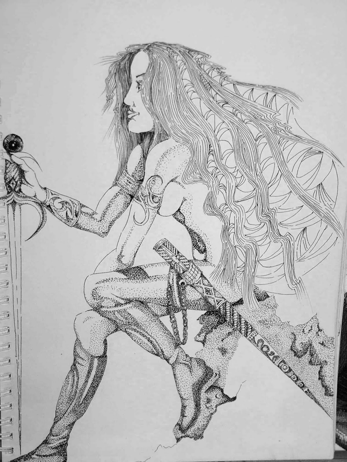
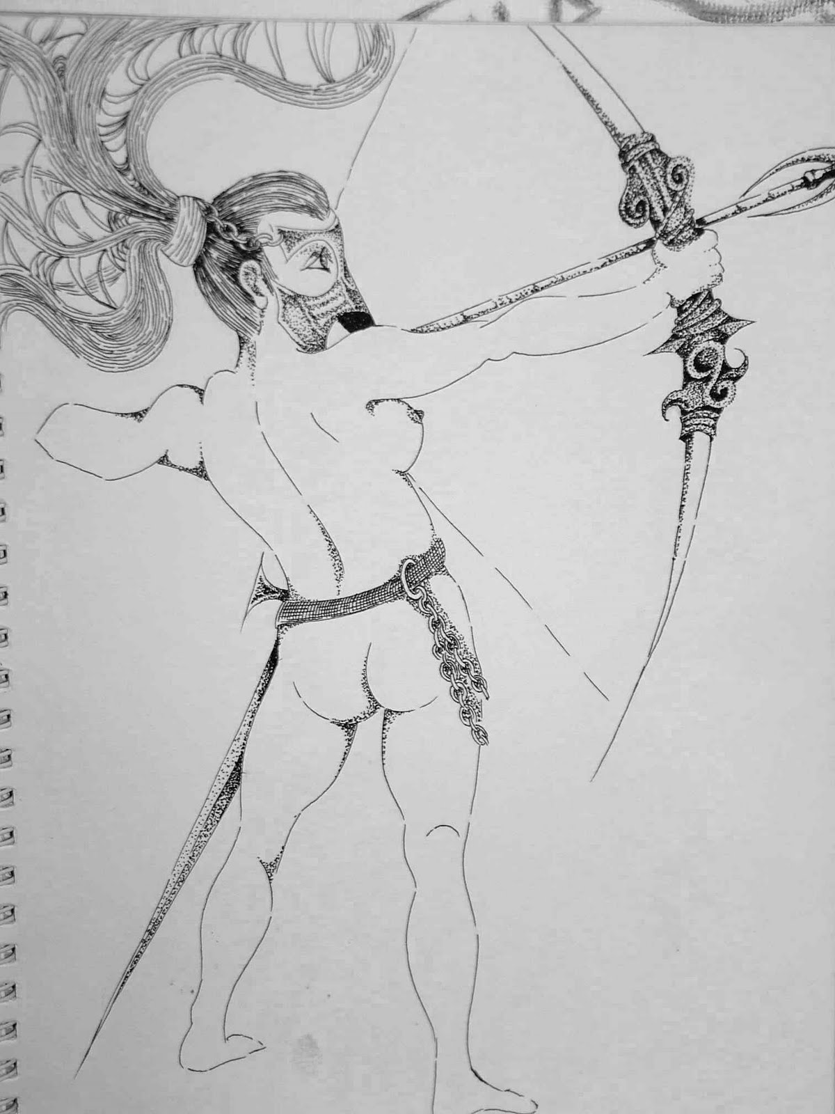

A series from my women warriors series
I've also created a range of bugs/insects from metallic ink too a small detail of a dragonfly
 a small detail of a dragonfly
Have a go yourself and get outside too - forget the pencil, leave it indoors and sketch. Don't worry about the lines the wobbly and un straight they are the more expressive it will be. Treat it as a sketch and don't go out with expectation of getting it right just enjoy it.
There's lot of different marks you can make with ink from dots to lines close together cross-hatching, you can always draw with the end of your paint brush or just a small branch/twig or a piece of bamboo dipped in ink.
Let me know how you get on!!!
That's all for today I'm off to draw a rather impressive iguana - I'll let you know how I get on.
All the best
Kat
Sunday, 25 April 2010
Exhibition in Aid of Macmillian Nurses
Hi everyone
Hope you are enjoying your weekend!
Some weeks ago my friend ask me if I would submit some work into her exhibition, which she is to host her home. We had done this some years ago in Aid of the British Lung Foundation and went very well.
My friend suggested that it would be nice to have some small pieces of work that people could buy at a fraction of the price of the larger pieces.
She suggested 8" x 8" block canvas, so I agreed to do 8 of them, I had forgotten how small 8 x8 is but decided to try koi on 4 of the and poppies on the others.
Most of my students will remember me more for telling them to work bigger and here I am doing smaller, small is something I struggle with I generally draw very big and so the paintings are the same.
A bit of challenge laid ahead just trying to get the fish drawn on the canvas in the first place, I always render the backgrounds completely first and let them dry before putting a drawing on the top.
You have no idea how many times I rubbed the watercolour crayon off before getting them the right size for the block!!
When eventually finished I was quite pleased with the results, I finished them off with some gold leaf.
I was really looking forward to see all the art up and displayed, some of the artists work larger than myself some smaller. It's great to see so may difference pieces of art in one place. When I got there yesterday some of my work had already been sold - guess which ones????
Koi again always the koi! I should have done more of them.
So I'd like to thank my friend, her husband and her family for their continued support in my art and giving me the opportunity to make the art do something special for someone by raising funds for worth while causes.
Now today I have to I have to get all the things I'll need for tomorrows first class, tomorrow is the first of my private classes. I thought as this will be the first should stick to doing something along the lines of a still life just to get people drawing and that way I will have idea where everyone is at.
Next challenge -what should I take as a still life and what should a still life contain??
So I have been trawling the Internet for examples of still life, this one I found is by George Flegel. I don't think you could get more in if you tried. However the painting is so well painted and covers a multitude of textures although mainly in the food department, which seems to appear in many if not 90% of still lives.

 This is by Pamela Michelle Johnson it's a large canvas in oil a whooping 72" high, and the realism is phenomenal. Again on the subject of food visit her at http://www.pamelamichellejohnston.com and see the rest of her work well worth a visit.I never had much time for still life although I did loads in the early days. I spent many hours working drawings on still life that consisted of rubbish and junk knowing that I would improve my observation and drawing skills no end. That didn't make me like them anymore for that.
Now I think perhaps I should spend some time doing some that interest me and that is probably true of everybody if you don't like the subject you wont give it your best.
So what do I think my student's will like - some like flowers some like animals and some like landscapes, how am I going to incorporate all that? After a rummage around the house I come up with a collection of objects that include a wooden horse head, an orchid plant, some old books, a large conch shell and an old glass ink well with an owl feather in it. The only thing that I can see being a problem is not having strong enough lighting to make interesting.
Why try one your self!
bye for now
Kat
Hope you are enjoying your weekend!
Some weeks ago my friend ask me if I would submit some work into her exhibition, which she is to host her home. We had done this some years ago in Aid of the British Lung Foundation and went very well.
My friend suggested that it would be nice to have some small pieces of work that people could buy at a fraction of the price of the larger pieces.
She suggested 8" x 8" block canvas, so I agreed to do 8 of them, I had forgotten how small 8 x8 is but decided to try koi on 4 of the and poppies on the others.
Most of my students will remember me more for telling them to work bigger and here I am doing smaller, small is something I struggle with I generally draw very big and so the paintings are the same.
A bit of challenge laid ahead just trying to get the fish drawn on the canvas in the first place, I always render the backgrounds completely first and let them dry before putting a drawing on the top.
You have no idea how many times I rubbed the watercolour crayon off before getting them the right size for the block!!
When eventually finished I was quite pleased with the results, I finished them off with some gold leaf.
I was really looking forward to see all the art up and displayed, some of the artists work larger than myself some smaller. It's great to see so may difference pieces of art in one place. When I got there yesterday some of my work had already been sold - guess which ones????
Koi again always the koi! I should have done more of them.
So I'd like to thank my friend, her husband and her family for their continued support in my art and giving me the opportunity to make the art do something special for someone by raising funds for worth while causes.
Now today I have to I have to get all the things I'll need for tomorrows first class, tomorrow is the first of my private classes. I thought as this will be the first should stick to doing something along the lines of a still life just to get people drawing and that way I will have idea where everyone is at.
Next challenge -what should I take as a still life and what should a still life contain??
So I have been trawling the Internet for examples of still life, this one I found is by George Flegel. I don't think you could get more in if you tried. However the painting is so well painted and covers a multitude of textures although mainly in the food department, which seems to appear in many if not 90% of still lives.

 This is by Pamela Michelle Johnson it's a large canvas in oil a whooping 72" high, and the realism is phenomenal. Again on the subject of food visit her at http://www.pamelamichellejohnston.com and see the rest of her work well worth a visit.
Now I think perhaps I should spend some time doing some that interest me and that is probably true of everybody if you don't like the subject you wont give it your best.
So what do I think my student's will like - some like flowers some like animals and some like landscapes, how am I going to incorporate all that? After a rummage around the house I come up with a collection of objects that include a wooden horse head, an orchid plant, some old books, a large conch shell and an old glass ink well with an owl feather in it. The only thing that I can see being a problem is not having strong enough lighting to make interesting.
Why try one your self!
bye for now
Kat
Saturday, 17 April 2010
new art classes


Hi there! Hope you all enjoying the lovely weather we've had today.
I'll will be starting a new art class on the 26th April 2010, this will run for 6 weeks at a time. They will cover a multitude on techniques over a range of media, allowing everyone to work on their own projects at their own pace regardless of ability. For further information send email via this blog.
During this wonderful weather it's at great time to get out doors and do some painting. I cant stress enough the importance of working from life at least part of the time. Photo's although handy as references are no real substitute for the real thing. You will learn far more by practicing life observations than slavishly copying from photographs. You have to remember that camera lens don't work like eyes and are limited to 2 dimensions, where eyes can decipher much more information second by second than a camera. You notice that parts of your photos will out of focus this is because the camera cant cope with all the information that is necessary. Where your can take in everything around you process it and understand it in a shorter time than it takes to take the picture.
So if you thought the camera never lies think again! it's limited to flattening out 3 dimension objects and not portraying true colour and tone. That's why you look fatter in photos!!!!
The watercolours above are from a trip to cornwall, I made sketches first then made quick small watercolours as the weather was not up to much, but it does give the me a better idea or should i say memory of the colours as you can match them more closely.
Have a go - and I'll upload some more soon.
Happy painting
Kat
Wednesday, 14 April 2010

Hi everyone!
Today I wanted to take look at process - the process that many professional Artists go through to accomplish a commission. It sounds relatively simple but it's one that has you loving and hating your own ability.
To begin with the idea that taking on commissions will provide you with an exciting prospect of doing what you love is only a half truth. Nobody can prepare you for the frustration that will ensue.
Imagine if you will you want to create a career painting/drawing/anything else creative, so you start by doing your stuff, things you like, things that excite you.
Soon someone calls you and asks you create something for them, this maybe a friend, family or client. Just as you think your going to get more of your work out there, your client says I would like you to do this, this and this and it must have this oh and can you do this? this is where the frustration starts.
It's pretty much what you'd expect from your family because you know they have no idea what their looking at, they just like it, but your client will!!! and they will want total control over what your doing, and as they are paying for the privilege so you must let them.
As fabulous as it is to have loads of clients wanting you, you will find that during the process of dealing with them you will lose a lot of sleep over the projects and wonder why your doing this.
This is mainly due to the fact that your client came with a prefixed idea in their head and they can see the finished result before you've done it.
So for a start make sure you meet your client face to face, write down all the keywords they use and make sure that you are understanding how they interpret those words, you'll be surprised at how much work it will save you in the long run if you just get them to doodle a sketch of what they mean. Although we communicate in words I have found them to be the biggest cause of mis-interpretation and the biggest cause of having to re-do work. In short what you call a spade might be some Else's shovel.
Once you have a brief please, please make sure you do sketches and don't proceed with anything until they are happy with the sketch. The other thing to watch out for is format not all clients understand our Art formats so you need to show them the exact support your going to be working on.
Next comes the tonal pic, work out if this is actually going to work once it's rendered, another thing to be crucially aware of is your composition - as said before you need to stick to what your client wants but if this does not lend it's self to a good composition, you will have to consult your client and possible start from scratch again. A bad composition and focal point will totally destroy your work and remember it's going to have your name on it!
You may find as I have, the only way to get things right so everyone is happy is keep starting again and re drawing and producing a small colour version. Keep your client working with you by involving all the way and that includes the colour scheme, as i said at the beginning they already had a prefixed idea and will still be wondering why they cant have exactly what they asked for!
You know as an artist that certain things just don't work in reality when it comes to painting so for instance keeping everything sharp and focused- in painting a real no no, but not to your client.
There are so many things that are going to get your goat, but as your go through the process more and more you'll learn to be much more methodical about how you arrive at your clients preconceived idea.
You will I guarantee you, there will be times when the customers is definitely wrong and want to give up, because you know that if they just left you to do your interpretation they'd be so much happier!! and process would be relatively painless
I'll touch on this subject again in the future, I hope do a video of a commission from the beginning going through the whole process to the finished result.
Don't let any of this put you off you have so much to learn about yourself from this.
That's all for today - thanks for taking the time to drop by.
Kat
Wednesday, 31 March 2010
I wanted to share this with you, I  was reminded today about the stages of learning I went through during my early years - I'd just like to thank Matthew Archambalt for some of his podcast that I found on Itunes the other day. It reminded me that learning to draw is the most crucial part of any art, especially for those of us who want to achieve realistic results.
Learning Atelier style drawing/painting takes a mass amount of effort and practice, and if your going to in daily practice then progress will be slow.
I spent many hours as a youngster drawing especially on the covers of my school books, only to be reprimanded. But I believe it was that constant doodling that made all the difference.
The painting to your left is actually a class demonstration that I did with a large class of approx 16 students over a 5/6 week period. We looked at Vermeer's work process and equipment, the oil paints available and the painting itself.
The painting is now 340 odd years old but still one of the most loved paintings of the public.
I challenged my class to work in the original stages that Vermeer had, and to only use the same palette that he would have used. I made them draw from scratch, the girl without any aids and only minimal help from me.
I should mention that some of my students were beginners and had never used oil paints before and very few could draw to the same standard as Vermeer.
Once the drawings were complete I showed them how to lay in the first layer concentrating only on the tonal value of the whole painting, using only white(flake) and umber. They got the hang of this after the second layer, I made them refine the whole painting using these 2 paints building form and interest.
This was then followed by the first layers of any colour all applied thinly and blended using soft haired brushes. You notice from mine that I omitted the fringing on her back and the intials in top left background just so theres no confusion.
The whole purpose of this, was enlighten my students the way of the Atelier style learning they embarking on and how this would have been to work for more hours than usual on the same painting.
I revisit this method of painting in another session, but for now I just wanted to highlight the need for practice everyday. I tell everyone if you cant set aside some time everyday then set aside 5-10 minutes everyday while you drink your tea/coffee in the morning and draw only what you actually see. If we look at Leonardo De Vinci or any other great master and try to work out how many hours they would have drawn for in a year you could looking at thousands of hours, so why would any of you think that to that good you could get away with anything less than a few minutes a day.
try it!! it will improve your ability in just a few short weeks and give you the motivation to do more.
only what you actually see! remember
til next time - Kat
 was reminded today about the stages of learning I went through during my early years - I'd just like to thank Matthew Archambalt for some of his podcast that I found on Itunes the other day. It reminded me that learning to draw is the most crucial part of any art, especially for those of us who want to achieve realistic results.
Learning Atelier style drawing/painting takes a mass amount of effort and practice, and if your going to in daily practice then progress will be slow.
I spent many hours as a youngster drawing especially on the covers of my school books, only to be reprimanded. But I believe it was that constant doodling that made all the difference.
The painting to your left is actually a class demonstration that I did with a large class of approx 16 students over a 5/6 week period. We looked at Vermeer's work process and equipment, the oil paints available and the painting itself.
The painting is now 340 odd years old but still one of the most loved paintings of the public.
I challenged my class to work in the original stages that Vermeer had, and to only use the same palette that he would have used. I made them draw from scratch, the girl without any aids and only minimal help from me.
I should mention that some of my students were beginners and had never used oil paints before and very few could draw to the same standard as Vermeer.
Once the drawings were complete I showed them how to lay in the first layer concentrating only on the tonal value of the whole painting, using only white(flake) and umber. They got the hang of this after the second layer, I made them refine the whole painting using these 2 paints building form and interest.
This was then followed by the first layers of any colour all applied thinly and blended using soft haired brushes. You notice from mine that I omitted the fringing on her back and the intials in top left background just so theres no confusion.
The whole purpose of this, was enlighten my students the way of the Atelier style learning they embarking on and how this would have been to work for more hours than usual on the same painting.
I revisit this method of painting in another session, but for now I just wanted to highlight the need for practice everyday. I tell everyone if you cant set aside some time everyday then set aside 5-10 minutes everyday while you drink your tea/coffee in the morning and draw only what you actually see. If we look at Leonardo De Vinci or any other great master and try to work out how many hours they would have drawn for in a year you could looking at thousands of hours, so why would any of you think that to that good you could get away with anything less than a few minutes a day.
try it!! it will improve your ability in just a few short weeks and give you the motivation to do more.
only what you actually see! remember
til next time - Kat
Tuesday, 30 March 2010
Hi There, my name is Kat, I'm a professional Artist who teaches on the side. I've been painting since I was 7, so more than 30 years. This is my first ever blog, but I was wanting to share some of the knowledge I have acquired over the years with anyone willing to learn or share!
I hope that we all get a lot from this interaction, as for many of us art is a lonely existence.
I've been teaching for many years now and for up to 30 weeks a year, the one thing I am asked most is how to get an imagination, note I said "get an imagination" this is how it's been put me on so many occassions. Although it makes me chuckle it's a serious question.
Many of my students come from academic backgrounds and draw/paint for a hobby, so they seem to be unable to tap into their creative talents, thus you find many hobbyists copying from photos, art books and magazines which stilt their ability to cultivate their own imagination.
If you suffer from this, it is a good idea to spend more time drawing from memory over and over again. The subject matter should be simple to start with a cup and saucer is a good place to start!
Look at it for a while, then face the other way and draw what you remember. This may seem like a point less exercise but it is the beginnings of your memories that will begin the transition from just copying to being able to create your own art!!
Virtually every form of art whether you like or not is formed by simple shapes that we all recognize, its just the way in which thay have been put together that makes the difference.
By doing you will be creating, by creating you will sharing, by sharing you will be embrassing our world and all that is in it!!
I hope that we all get a lot from this interaction, as for many of us art is a lonely existence.
I've been teaching for many years now and for up to 30 weeks a year, the one thing I am asked most is how to get an imagination, note I said "get an imagination" this is how it's been put me on so many occassions. Although it makes me chuckle it's a serious question.
Many of my students come from academic backgrounds and draw/paint for a hobby, so they seem to be unable to tap into their creative talents, thus you find many hobbyists copying from photos, art books and magazines which stilt their ability to cultivate their own imagination.
If you suffer from this, it is a good idea to spend more time drawing from memory over and over again. The subject matter should be simple to start with a cup and saucer is a good place to start!
Look at it for a while, then face the other way and draw what you remember. This may seem like a point less exercise but it is the beginnings of your memories that will begin the transition from just copying to being able to create your own art!!
Virtually every form of art whether you like or not is formed by simple shapes that we all recognize, its just the way in which thay have been put together that makes the difference.
By doing you will be creating, by creating you will sharing, by sharing you will be embrassing our world and all that is in it!!
Subscribe to:
Posts (Atom)